To lie through omissions
Notice! I have deleted the identity of all the individual comments in order to protect them. I have written this article because I think it serves as a good example of how we are lied to continuously through cherry picking and omissions of important facts. Remember that the global warming/climate change madness costs the humanity roughly $1000 million (the same in Euros) per day. The result of years of investments of this magnitude can not so far not be measured. Also remember that one half day’s global climate investments buys you for example a desalination plant that produces 627 000 cubic meters of water a day which is 20% of the total water use in Israel. The price of the water is roughly 50 cents/cubic meter. I happened to comment on a post on Facebook. The original post was related to:
”In 50-49 vote, US Senate says climate change not caused by humans…”
I knew my comment would cause some discussion: ”Nice to see that politicians are waking up. Where is the catastrophe that has been preached since the end of the 1980-ies? The arctic sea should have disappeared ten years ago … sea ice levels are today within normal variation. Sea levels should have risen by 20 … 30 cm since the 1980-ies according to doomsday mongers (taking about a sea level rise of 3 meters by 2100) … have you looked at the sea shore? Has the sea shore been crowding up on you?
I am a physicist. Where are the proofs? Consensus has unfortunately nothing to do with science! Remember that once a majority of judges said that Galileo Galilei was wrong regarding the mechanics of the solar system. Have you yourself checked some simple facts yourself to ensure that the consensus isn’t wrong?”
I leave out irrelevant comments. I got the following reasonable comment:
Lars, you ask ”where are the proofs”. I suspect that you are not actually open to an answer, that you have no interest in factual evidence. But just in case:
http://climate.nasa.gov/evidence
The relevant part pointed to was this picture:

CO2 level in the atmosphere for the last 400 000 years. Source: NASA.
The picture provided by the person is correct. Without checking the source in this case I accept the picture and the indicated CO2 levels but still I say that the picture is an extreme case of a lie … why? My comment was:
Comment to XXXX (notice I am not saying you are lying, I think you aren’t well informed):
It is said there are three levels of lying. Going from the most basic to the most advanced they are:
1) You simply tell something that isn’t true. No comments needed. Doesn’t work well.
2) You tell the truth (your picture above) but you leave out important information that completely distorts what actually is said.
3) The most advanced way of lying is to tell the whole truth but you tell it in a such a way that nobody believes you …
Your picture above is correct. I haven’t checked the exact source but the picture looks absolutely reasonable … but is it the truth?
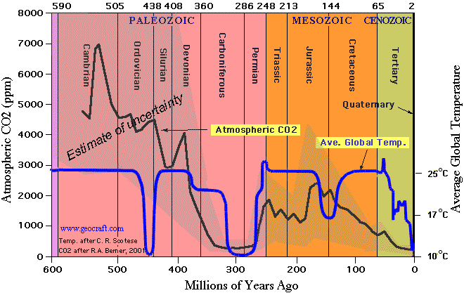
The graph goes back 400 000 years which is a very short time as seen from a geological point of view . Is this a representative picture? The answer is no. The problem is that the picture shows only a very short period of earth’s history characterized by a number of ice ages … a very rough and hard time in the history of our planet.
Look at the bigger picture. You can see that the atmospheric CO2 concentration has been 15 times higher than now in the past . The scary NASA picture you presented cherry picks an extremely short time period to make a point … I would call this lying (NASA) because they know exactly what they are doing.
If you have a friend that is growing crops in a greenhouse you know that many farmers artificially increase the CO2 content inside the greenhouse by burning for example natural gas. A good CO2 level a farmer tries to reach is ca. 2000 ppm (five times the level of CO2 naturally in the atmosphere). The reason why this is done is that at present CO2 levels green plants are starving. In your picture there are short periods where the CO2 level goes below 200 ppm … this is where experiments show that some plants start to die due to lack of CO2. If you look at my larger picture you see that for almost 200 million of years the CO2 level has been above 1000 ppm and plants have genetically adopted to this CO2 level which means that going back to this ”normal” CO2 level increases the growth 2 – 3x dependent on the exact plant being grown.
Notice that the exact CO2 levels in the picture can be discussed but the order of magnitude is correct. The picture provided by NASA represents CO2 levels that almost drop out of the graph as seen over a more reasonable geological period. Is the NASA picture scary. Answer no … only if taken out of context.

The CO2 level and the temperature during the last 600 million years. Source: http://www.geocraft.com/WVFossils/PageMill_Images/image277.gif
There is another scare meme that pops up all the time … rising sea level. I think it is useful to have a very short look at that too.
Lars: Regarding a catastrophic rise of sea levels. The land rises ca. 30 cm/century in southern Finland. The low estimates of sea level rise in today’s doomsday scenarios is ca. 30 cm/century (3 mm/year) and the really scary estimates say up to several meters of sea level rise. Measurements show this (link below). The land continues to rise from the sea … if the low estimates are true then we should see roughly a fixed sea level in Helsinki but we see the rise of the land from the sea continue as before … something doesn’t compute as the nerds say.
This is what real measurements show for the southern parts of Finland. Shouldn’t a catastrophically rising sea level be easy to see as a hockey blade on the previously sinking sea level. The sea level is sinking due to the rebound after the ice age when we had perhaps one kilometer (3000 feet) of ice pressing down the land below.

Sea level change in Helsinki Finland. Notice how the sea level continues to go down due to the re-bound after the ice age. No real change in the trend can be seen. If the scary doomsday scenarios were correct we should see a clear ”hockey blade” at the right hand side of the picture … but nothing is seen. Source: NOAA

Lämna en kommentar